
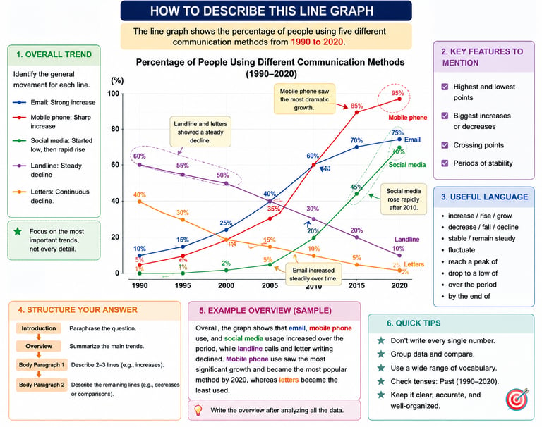
How to Describe Line Graphs in IELTS Academic Writing Task 1
Describing line graphs effectively in IELTS Academic Writing Task 1 requires more than simply reporting numbers. Candidates must identify key trends, compare data accurately, and present information in a clear, organized manner. Understanding how to use trend vocabulary, time expressions, and comparative language helps create a coherent report. This guide explores essential techniques for analyzing line graphs and structuring responses that meet IELTS assessment criteria and support higher band scores.
IELTS ACADEMIC - MODULE WRITING
Syed Muhammad Zargham Hameed
5/26/20267 min read

Understanding Trends: Upward, Downward, and Stable Movements
When analyzing line graphs in IELTS Academic Writing Task 1, identifying and describing different types of trends is crucial. Trends can generally be categorized into three main types: upward trends, downward trends, and stable movements. Each category exhibits distinct characteristics that can be articulated using specific academic vocabulary.
An upward trend indicates a progressive increase over time within the data set. This may be portrayed through a steadily rising line, illustrating a consistent growth pattern. Vocabulary such as "surged," "rose," "grew," or "climbed" effectively conveys the essence of this trend. For example, one might note that the sales figures surged sharply between 2010 and 2015, reflecting a burgeoning market demand.
Conversely, a downward trend demonstrates a decrease in values, represented by a declining line in the graph. Here, terms like "fell," "declined," "dropped," or "plummeted" would aptly describe the situation. An effective description could state that production levels dropped significantly from 2016 to 2018, indicating a possible market contraction.
Stable movements depict periods where data values remain constant over a certain timeframe. Such trends can be illustrated by a horizontal line, signaling no significant fluctuations. Words like "remained stable," "held steady," or "plateaued" can be utilized to convey this trend. For instance, an assertion might be made that the attendance figures plateaued from 2019 to 2021, reflecting market saturation.
By understanding these trends and effectively employing pertinent vocabulary, candidates can enhance their descriptions of line graphs in the IELTS Writing Task 1. This knowledge allows for clear and precise communication of data patterns, which is essential for achieving a strong score in the academic writing assessment.
Comparing Multiple Lines Without Losing Clarity
When tasked with describing line graphs in IELTS Academic Writing Task 1, presenting a coherent comparison among multiple lines is essential for effectively conveying the data. To achieve this, it is crucial to clearly identify the lines or datasets being discussed, often by referring to them using distinct descriptors or colors as indicated in the graph itself. This approach not only aids in clarity but also assists the reader in visualizing the relationship among the different datasets.
A practical technique for comparing lines involves highlighting their similarities and differences. For example, if two lines represent similar trends, such as both experiencing a steady increase, it is beneficial to acknowledge this by stating, "Both lines A and B exhibit an upward trajectory during the observation period." This phrasing emphasizes the relationship between the two lines, fostering a clearer understanding of their performance relative to each other.
Moreover, when describing intersections between multiple lines, it is key to indicate when one line overtakes another or when they converge. For instance, stating that "Line A crossed Line B at the midpoint of the graph" effectively communicates a significant point of comparison. Additionally, implementing comparative terms such as "higher than," "lower than," or "equal to" can further help delineate the differences in performance among the lines.
Furthermore, discussing ranking changes among the lines enhances the comparison. This could be articulated as: "Initially, Line C had the highest value; however, by the end of the period, Line A ranked first, while Line C dropped to third place, reflecting a notable shift in trends." Employing such language facilitates a comprehensive view of the trends exhibited by the various lines.
Understanding Key Features in Line Graphs
In the context of IELTS Academic Writing Task 1, possessing the ability to select and emphasize key features from line graphs is essential for forming an effective response. This task does not require a detailed account of every data point; instead, it necessitates critical analysis and the extraction of the most significant trends, patterns, and anomalies. To successfully identify these features, a systematic approach is beneficial.
First, one should begin by examining the overall trends presented in the graph. For instance, whether the line shows an upward or downward trajectory, or if it remains steady over time, provides a snapshot of the main message. Additionally, peaks and troughs that indicate sudden changes or significant shifts in data can be noted as they hold critical relevance. Features such as these not only assist in constructing a clear overview but also align with examiner expectations by illustrating a good grasp of the visual data.
Furthermore, comparing multiple lines within the graph can unveil comparative insights that are vital. For instance, highlighting which line dominates in value at certain points or how they relate to each other across the time intervals can bring depth to your analysis. However, it is crucial to avoid excessive detail. Mentioning every fluctuation or minute change may detract from the clarity of the response and could appear as if the writer lacks a focus on key trends.
By refining the skill of identifying pertinent data and trends, candidates can enhance their descriptions, thereby elevating the quality of their writing. This critical selection not only leads to a more coherent narrative but also ensures that the most relevant aspects of the line graph are thoroughly communicated, thus making the task more effective and aligned with high-scoring criteria.
Using Time Expressions and Data Language Effectively
When tasked with describing line graphs in the IELTS Academic Writing Task 1, it is crucial to utilize time expressions and specific data language effectively. These elements are fundamental in illustrating trends and changes over a specified period. Particularly, the incorporation of dates and time frames, such as 'from 2000 to 2020,' provides a clear context for the data presented. This precision allows for a more complete understanding of the trends depicted in the line graph.
For example, when stating that 'the percentage of internet users rose from 10% in 2000 to 85% by 2020,' the phrase "from 2000 to 2020" serves as a vital time expression that anchors the reader to the timeline of the data. Furthermore, expressing numerical changes using language such as 'increased,' 'decreased,' 'fluctuated,' or 'remained stable' enhances the clarity and dynamism of the report.
To convey relationships between the data points effectively, it is advisable to incorporate comparative phrases. Instead of merely stating numerical values, one can say, "In 2010, users saw a peak, reaching a significant 75% before a slight decline in the following years." This approach allows for a narrative that enhances understanding without overwhelming the reader with raw numbers.
In addition, describing percentage changes succinctly can provide insight into the significance of the trends observed. Phrases like "showing a 50% increase over the decade" help describe the implications of the data succinctly. Therefore, using a combination of varied time expressions and specific data language can create a more narrative-driven report that flows coherently and intuitively while effectively conveying all necessary details regarding the line graph.
Structuring a Band 7+ Line Graph Report
To achieve a band score of 7 or higher in the IELTS Academic Writing Task 1, it is imperative to structure your line graph report effectively. This involves a well-organized framework that includes an introduction, an overview, and body paragraphs. Each component plays a crucial role in conveying information clearly and logically.
The introduction serves as the first point of contact with the examiner. Here, you should paraphrase the task prompt, summarizing the key features of the line graph. This not only demonstrates your reading comprehension but also sets the stage for your report. For instance, if the graph depicts the changes in temperature over a year, an effective introduction might include the overall trend and key figures, giving a clear indication of what the graph represents.
Following the introduction, the overview paragraph is essential. This section should summarize the main trends, differences, or notable features without delving into specific data points. The examiner appreciates concise insights that highlight the main trends, such as overall increases or decreases, peaks, and troughs. By focusing on the general patterns, you fulfill the expectation of providing clarity and a brief analysis of the graph's content.
Lastly, the body paragraphs should provide detailed information regarding the specific data depicted in the line graph. This is where you analyze performance over time, comparing different sets of data. Make sure to organize your body into logically connected paragraphs that convey the progression of the data clearly. For instance, dividing your analysis into periods or categories can enhance clarity. Using cohesive devices and varying your vocabulary will further make your report more sophisticated and engaging.
Common Mistakes to Avoid in Line Graph Descriptions
When preparing for the IELTS Academic Writing Task 1, particularly when tasked with describing a line graph, candidates often encounter several pitfalls that can undermine their performance. One prevalent mistake is the misinterpretation of the data presented. Candidates might fail to recognize trends accurately or misrepresent the scale of the graph, leading to incorrect conclusions. It is essential to understand not only the figures but also the overall trend that the graph conveys. For instance, if a line graph shows an increase followed by a decrease, a well-rounded description would involve outlining both movements rather than focusing solely on one trend.
Another common issue arises from an excessive attempt to provide clarity, often termed 'over-clarity.' This occurs when candidates include overly detailed interpretations of every small fluctuation within the data. While detailing trends is important, it is equally critical to focus on the main features and overarching trends. Instead of describing every rise and fall, it is advisable to summarize significant increases and decreases, providing a coherent narrative that fully encapsulates the line graph's essence.
Inappropriate vocabulary use also tends to plague candidates. The choice of words must suit the formal academic tone expected in IELTS writing. For instance, using informal terms such as "big" or "huge" may not be appropriate; instead, substituting these with terms like "substantial" or "considerable" can enhance the formality of the description. Additionally, synonyms for common phrases—like "increase" can be replaced with "rise" or "growth"—contribute not only to clarity but also demonstrate a broader range of vocabulary, which can positively impact the assessment. Through recognizing and correcting these common mistakes, candidates can improve the clarity and accuracy of their line graph descriptions, ultimately enhancing their performance in the IELTS exam.
Practicing with Sample Graphs and Exercises
Successfully describing line graphs for the IELTS Academic Writing Task 1 requires dedicated practice and a systematic approach. Engaging with various sample line graphs not only helps in understanding diverse data presentations but also enhances the skill of accurately articulating trends and patterns. Candidates should strive to source a variety of sample line graphs, whether from ZAR Academia's official IELTS preparation materials, ZAR Academia's educational website, or its academic texts. Familiarizing oneself with different styles and complexities will provide a broader perspective and improve descriptive abilities.
To maximize the effectiveness of practice, candidates are encouraged to perform targeted exercises. These can involve analyzing provided graphs and writing summaries, focusing on key trends, comparisons, and data fluctuations. Writing under timed conditions similar to the actual exam will help build speed and confidence. Furthermore, incorporating feedback through peer review sessions can be tremendously beneficial. By discussing interpretations and writings with peers, individuals can gain insights into different approaches, refine their analytical skills, and receive constructive criticism.
To simulate real exam conditions, allocate a specified timeframe to complete writing tasks. This technique aids in managing time effectively during the actual exam. Engage with exercises that challenge the ability to describe unexpected data changes or subtle trends, as these aspects often present difficulties for candidates. Repetition is key; regularly practicing with line graphs will lead to improved fluency and comfort in approaching the IELTS Writing Task 1. Ultimately, combining these methods will equip candidates with the tools necessary to confidently describe line graphs, ultimately boosting their performance on the IELTS exam.